_______________
We need colour. It defines our world and makes us feel alive.
_______________
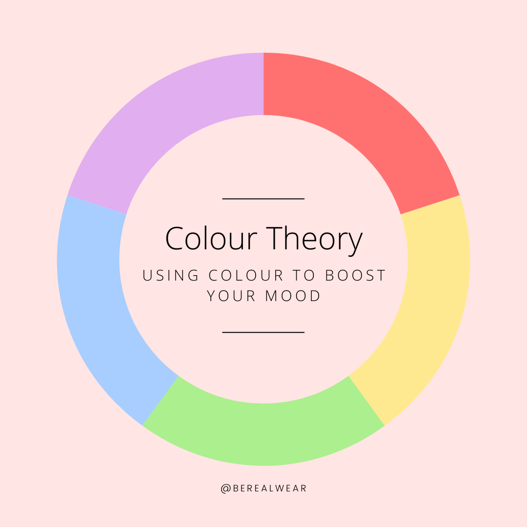
What is colour theory? It is a guide to colour mixing and the visual effects of colour combinations. You might not realise it, but we use colour theory every day. We use it with what we wear and how we decorate our homes. There are specific colours that can help boost our mood.
So, let’s have a look and see what each colour has to say.
Red is the warmest and most dynamic colour, this is because it has many meanings such as power, passion, anger and danger. The colour makes you feel passionate and energized. It is used to stimulate the body and mind and to increase circulation. Red has a powerful effect on emotions, it can be linked with confidence. It’s attention-grabbing and inspirational, and a great colour when you don’t mind standing out from the crowd.
Orange makes you feel energized and enthusiastic. The colour orange enhances a feeling of vitality and happiness. Like red, it draws attention and shows movement but is not as overpowering, it is a well-balanced colour.
Yellow is associated with feelings of positivity and purification. The colour yellow makes you feel happy and spontaneous. Yellow is perhaps the most energetic of the warm colours. This uplifting colour can help you to feel cheerful and optimistic.
Green, this hue is mostly associated with vibrancy in nature is believed to encourage harmony and regeneration. The colour green makes you feel optimistic, refreshed and symbolizes health, new beginnings and wealth.
Blue is a restful shade that has feelings of relaxation and calm. There is no surprise that it’s the most favoured of the colours. Wear lighter shades of blue to feel refreshed and energised. Darker shades of blue, on the other hand, are linked with a sense of authority and power.
The colour pink makes you feel playful and romantic. The colour bright pink is considered to portray confidence, playfulness and flirtation, whereas lighter shades of pink are calmer, warming and welcoming.
Purple makes you feel creative. Purple is associated with royalty and wealth. Whereas, lighter shades of purple are often used to soothe or calm. The colour violet taps into a meditative and soothing vibe.
Brown is a grounding colour that makes you feel down to earth. It’s warm, friendly, practical and dependable, but can also represent old fashioned and well established. It’s a great colour to wear when you want to feel mature and sophisticated.
White is a minimalistic colour. The colour white is seen as purity and innocence. It’s also the most neutral colour of all. The fashion colour theory behind white is that it is associated with feelings of freedom and can be great for helping you make the most of new beginnings.
Grey can be seen as serious and professional. The colour grey has positive connotations including formality and dependability. It’s a safe colour.
Black feels sophisticated, classic and serious. The colour black evokes power, luxury and elegance. But can also mean professionalism and simplicity.


